MOMO
Role: Product Developer | Type: Personal | Design Timeline: 1 week | Development Timeline: In Progress Tools: Figma, Github, VS Code, React-Native | Device Compatibility: MobileTHE VISION
Design a wellness app that would make the most out of the limited to zero internet connection connection on subways
THE INSPIRATION
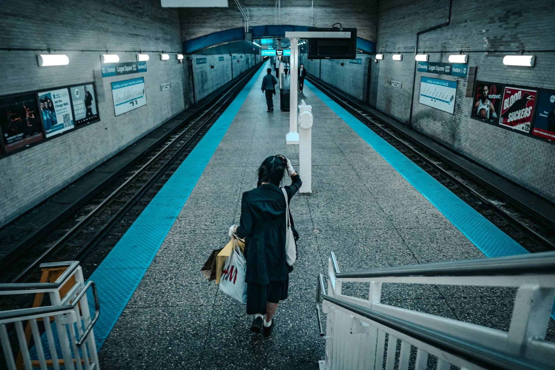
Naturally, I was inspired while commuting. Looking around the train, I saw parched eyes and over-stimulated commuters.
Was there something I could do? What would it look like? What would it feel like?
UNDERSTAND
Queens is…
20.8% Black
Overloaded
Fast-paced
Adaptable
Diverse
Who?
Commuters. The people of Queens, NY to be exact.
Queens is one of the most diverse places in the US. You look around and see commuters from all backgrounds and walks of life. It was important that the app took this in mind.
Needs & Desires
Shorter commute time! They have things to do and people to see
Some way to decompress and reenergize before the next work day
Less busy stop! It would be nice to not weave through crowds just to be crammed in the bus/subway
Internet when riding the subway underground to stay connected
More patience, less anxiety
27.9% Asian
Key Behaviors
Commutes regularly on the bus or subway to/from work
Speaks their native language at home with family
Arrives home to be greeted by more flashing lights and noise that comes with city living
Stays caffeinated to keep up withe hustle & bustle
Squeezes in chores and errands in their busy schedule
51.1 % Women
47.1 % Foreign Born
55.4% Language other than English Spoken at Home
34.8% Bachelors Degree or Higher
28.2% Latino
23.9% White
IDEATE
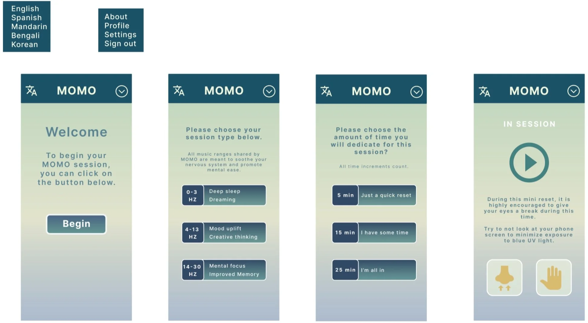
UI Ease
UX Ease
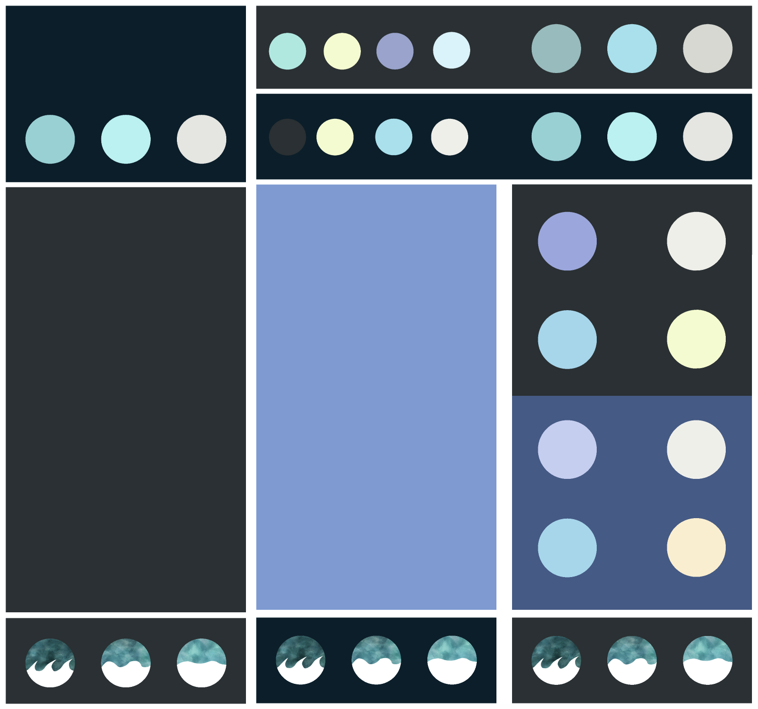
I really wanted to include water. The ocean and the sound of waves can be very calming and soothing.
Most of all, I wanted to the user to have some sense of escape from the noises of outside world. But there was something off visually about using blue and green color palette…
The most popular color preferences for business websites: blue 46% | green 30%
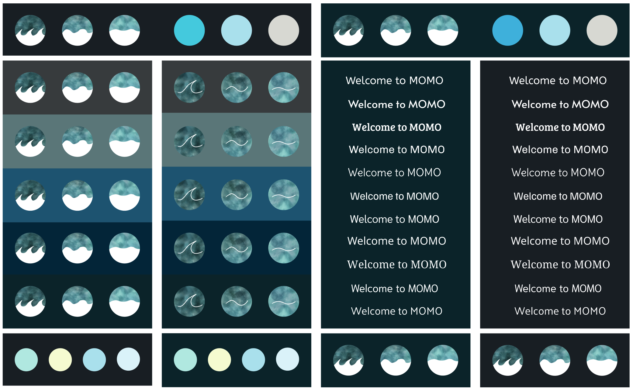
Keep the water | No blue tints | No green tints | No business reminders
Effortless— only the basics
Focused— flat structure
Accessible— regardless of language or tech savviness
Simplicity— no distracting colors
Calming— soft on the eyes
DESIGN
SIMPLICITY &
ACCESSIBILITY
THE POWER OF THREE
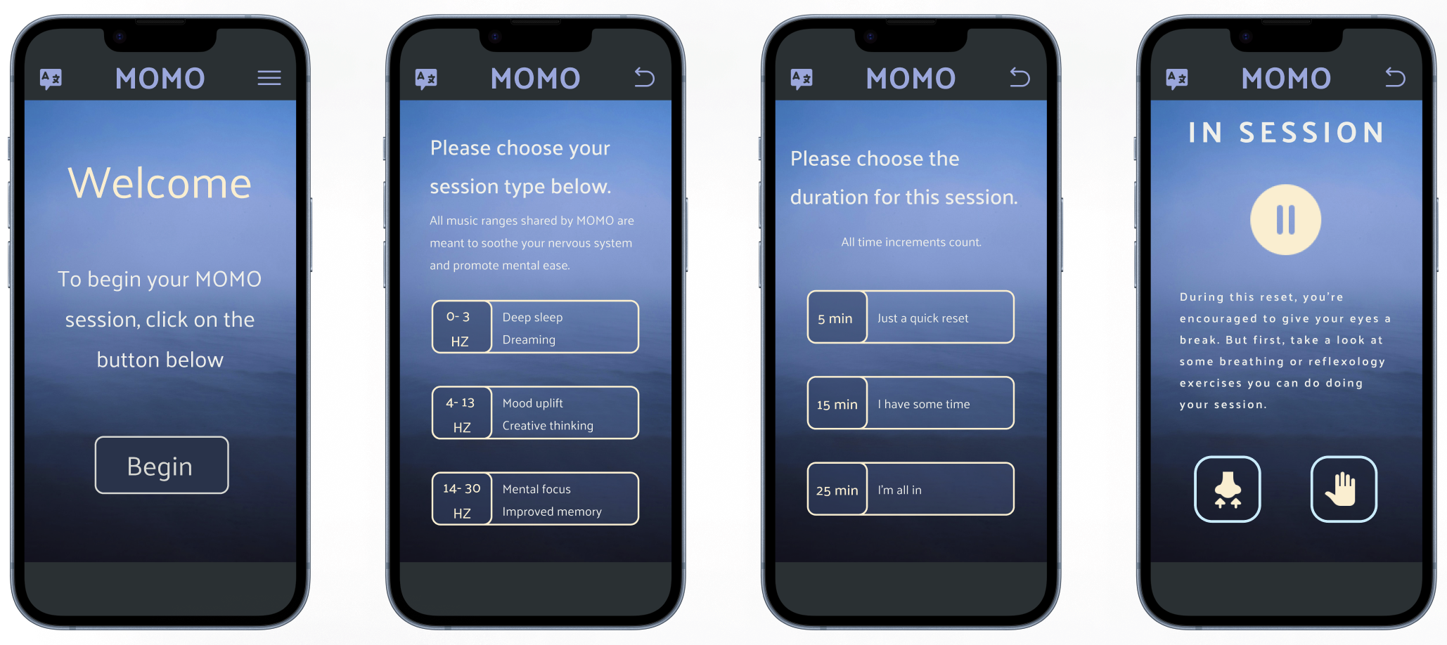
3 clicks to get to a MOMO session
3 choices max for any question
3 wellness offerings to explore
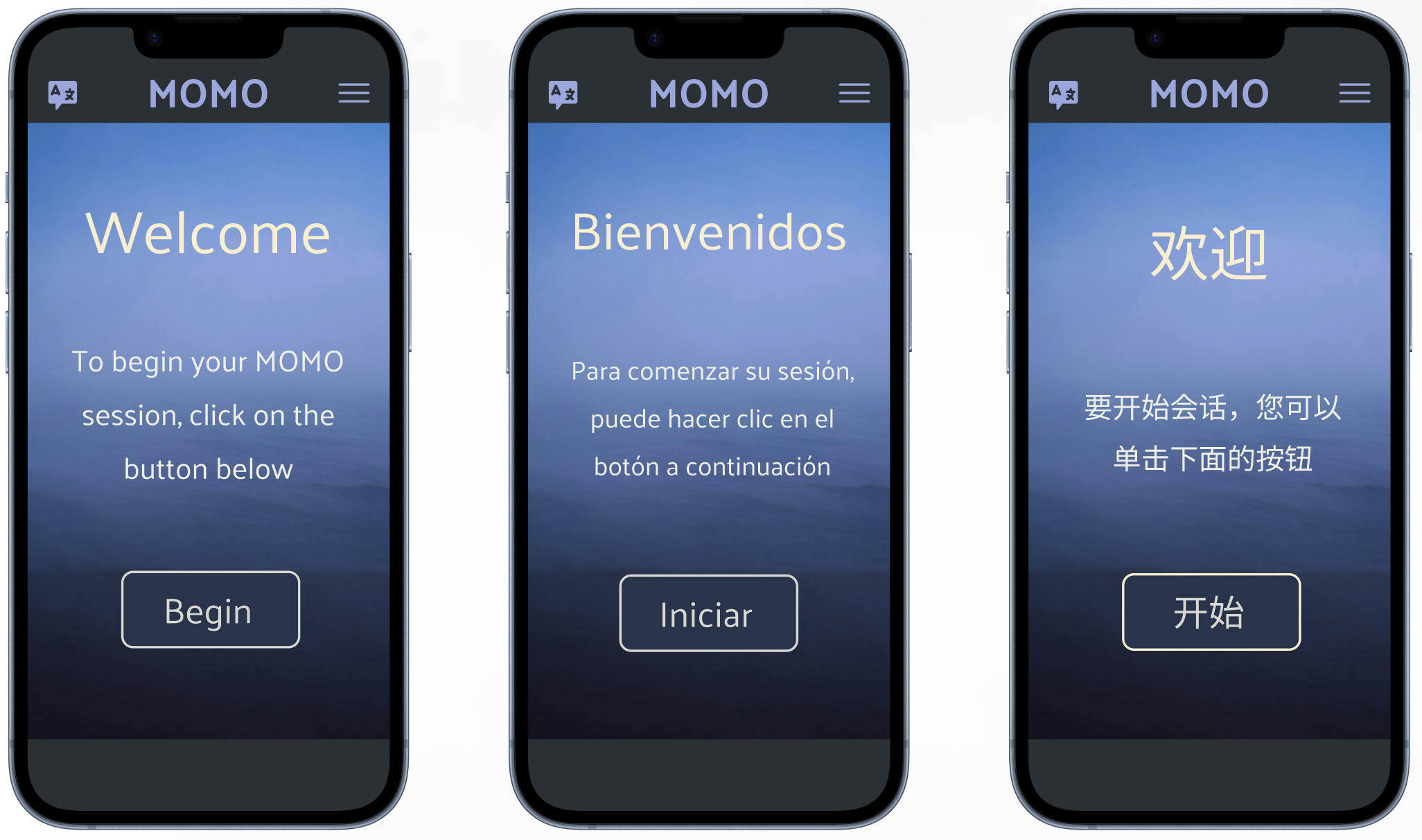
THE POWER OF LANGUAGE
EN, ES, and ZH are available. Users choose what they are most familiar and comfortable with.
MOMO
A mental wellness
tool for commuters
on the move
NEXT STEPS

On the product side:
Start planning and designing for the reflexology screen. The visual components and interactions should maintain simplicity while offering a more complex interaction experience.
Collect user feedback (visuals, sounds, translations, navigation, user flow). At the end of the day, it should provide an experience that optimizes accessibility and encourages users to engage in wellness sessions during commutes.
Improve translations! Wording and translations need to be revised and eventually localized to make sure that all messaging is clear and helpful.
On the development side:
Update code to reflect the newest UI visual designs. The current UI reflects the original MVP.
Add sound options for 15 min and 25 min sessions and minimize the amount of memory/storage used for offline sounds.
