Tattoo Marketplace
Role: Consultant, Product Strategy | Type: Undisclosed Client | Timeline: 1 week | Tools: Figma, Canva, Excel | Device Compatibility: MobileTHE CHALLENGE
Design an experience that improves user engagement, especially for tattoo artists. Activity on the platform was not good enough and there weren’t enough tattoo artists on the platform.
THE DESIGN PROCESS
Despite the limited time to work on this project, it was important to prioritize research in order to understand tattoo artist and their client. The findings from user studies influenced the final UI/UX prototypes. As such, I decided to work with Discover, Define Design.
DISCOVER
I researched competitors to understand what other applications were offering tattoo artists. It was important to understand how to establish competitive differentiation, both from booking and social media platforms.
Through user research, I wanted to understand the users’ pain-points. What were the most pressing experiences to address? How can I improve them?
EXPRESSIVE
RESOURCEFUL
PASSIONATE
THOUGHTFUL
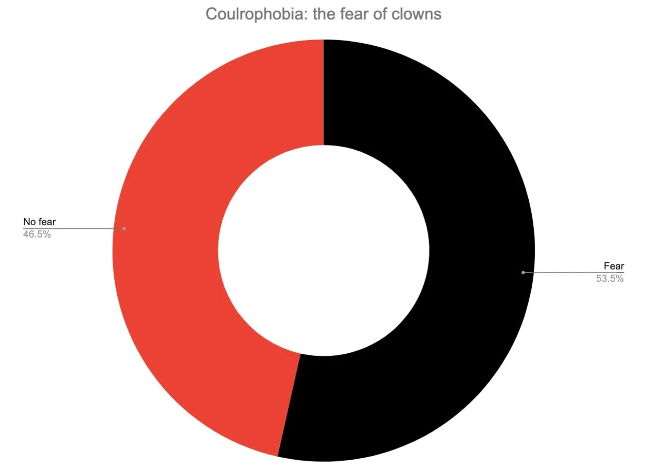
In the most recent study on coulrophobia, 53.5% of respondents had some degree of fear of clowns.
I didn’t research on skulls and went along with the assumption that they do not offer a wide appeal. Still, I’d love to explore this answer in the future.
Beliefs & Attitudes
Has a preference for their personal tattoo style and aesthetic. Sees their work as a part of their brand and their brand as a part of their identity as an artist
Has great attention to detail and is highly critical of visual appearance & design
Values self-sufficiency and their time
Needs & Desires
An aesthetically pleasing platform for their work that has flexibility for personalization.
Clear and efficient communication with clients in order to secure bookings and plan their schedule
Visibility to be able to reach potential clients that are not following their social media or involved in the tattoo community
Key Behaviors
Often sketching new ideas when they’re not working on a tattoo piece
Active in the local tattoo community
Posts their work on social media and on different platforms
DEFINE
Ease of Use
Visual Appeal
New Features
There were no features that differentiated the app from other tattoo booking platforms. There was no nothing to entice tattoo artists to join yet another app that doesn’t have the reach or engagement of social media platforms like Instagram. Even if all functionality issues and visual design issues were resolved, it would not be enough to increase market expansion. Simply put, the app needed to provide a feature that no one else is offering.
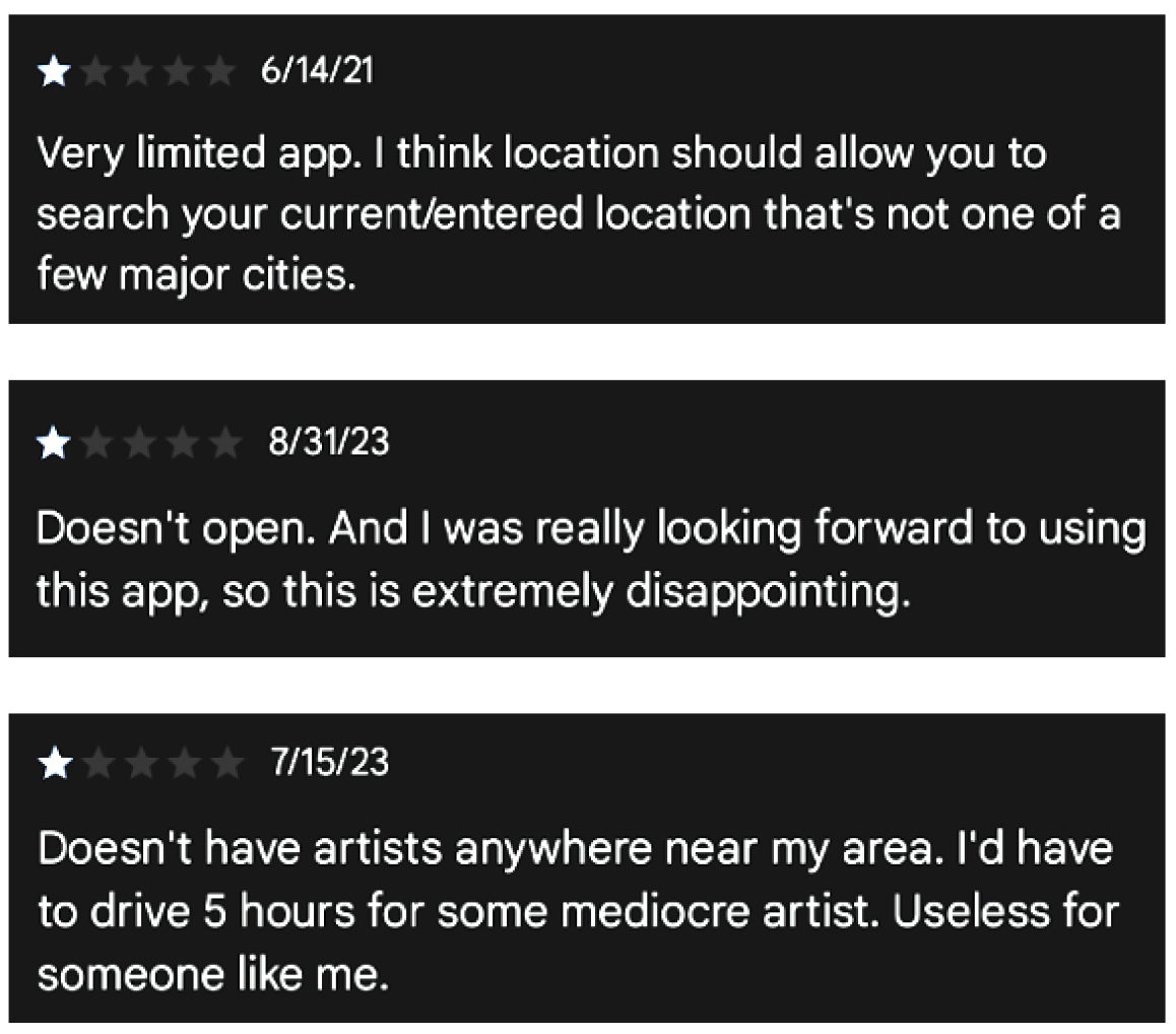
A number of platform users were immediately discouraged due to the limited search functionality of the application. Nearly 40% of reviews on the Android PlayStore mentioned the location filter as a pain-point. The design of the Artist Search became #1 priority since it was clearly the largest deterrent to user engagement for potential clients. Also, the search filter alienated tattoo artists that are not in tier 1- 3 cities and therefore provided no value to their business.
Next, the overall look & feel of the app needed to be improved. The original designs were clearly biased towards one type of tattoo style and aesthetic. This is most notable in the user profile show above (default skulls and clowns for all!). Furthermore, the app only offered a dark-mode environment. It simply didn’t have wide appeal. Tattoo artists needed a clear and flexible canvas for their profile in order to want to showcase their brand and portfolio on the app.
REFINE &
REDEFINE—
ARTIST
SEARCH
DESIGN
EASE OF USE
Location Filter Functionality
CHALLENGE | The original location filter didn’t have search functionality, which meant that client users would have to do lots of scrolling. On top of that, only tier 1- 3 cities were listed in the location filter. Every other location was grouped into “Other”. Also, the location selection only allowed for single-select. This was a drawback for all users since it didn’t take into account that tattoo clients are often willing to travel to nearby cities for a tattoo appointment.
LIMITATIONS | For this project, the client had already reached their budgetary limitations. Therefore, the design choices needed to account for the number of developers available, their expertise levels, and the timeline. As such, the location filter could not be redesigned to include a Live Map that could account for Current Location and Radius.
SOLUTION | First, I added a search bar in order to reduce user fatigue. It was also necessary to remove the “Other” option since it provided no value in narrowing a search and unjustly filtered out artists who were not in main cities. Counties needed to be added to the location database to capture all other artist locations. Lastly, the location filter was converted to a multi-select.
Information Architecture
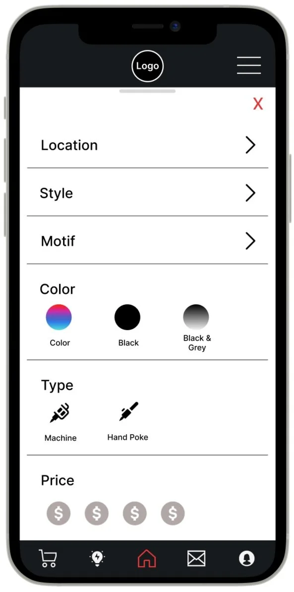
The original filter component included only 3 categories. Not only was the look & feel too simplistic but the Style category contained elements that are not technically style elements. The Style category needed to be broken down into categories that were mutually exclusive and revealing of the type of choice being made.
VISUAL APPEAL
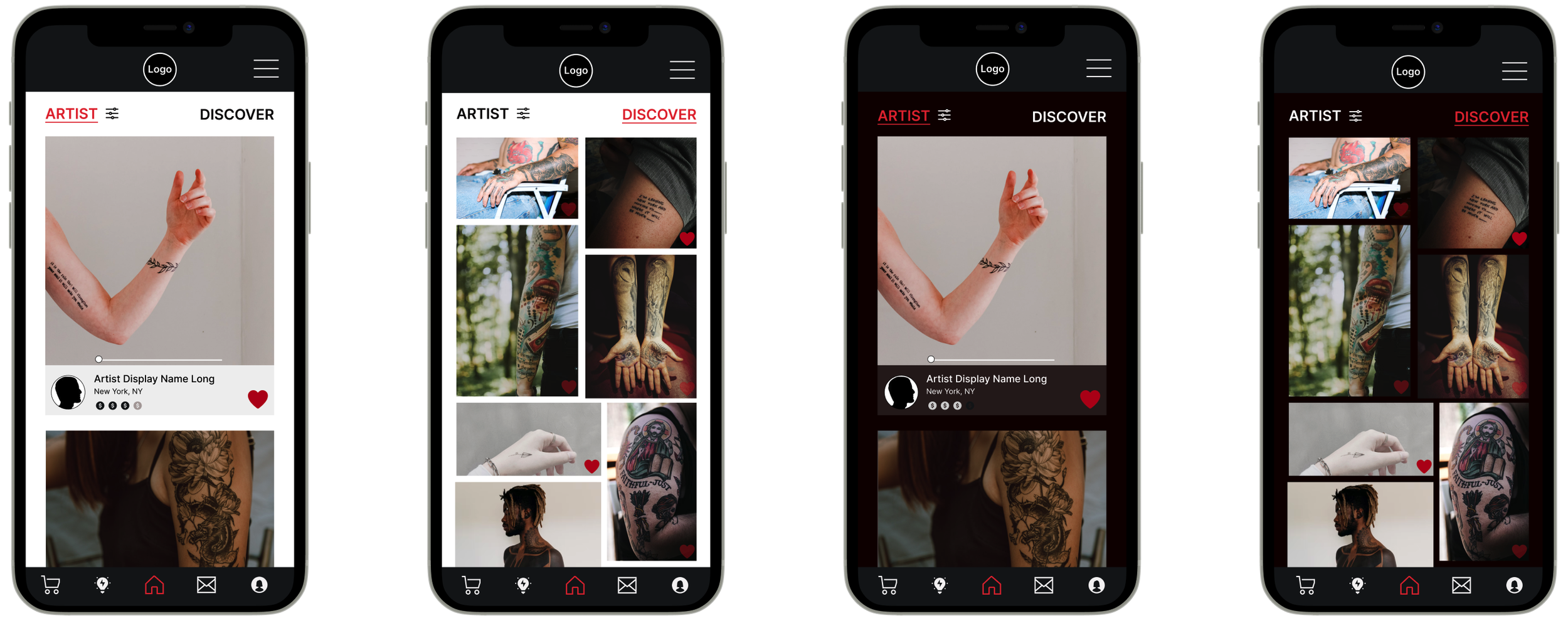
LIGHT
MODE
DARK
If its slow to load
Make it entertaining
DISCOVER TAB
A TATTOO APP FOR THE ARTISTS
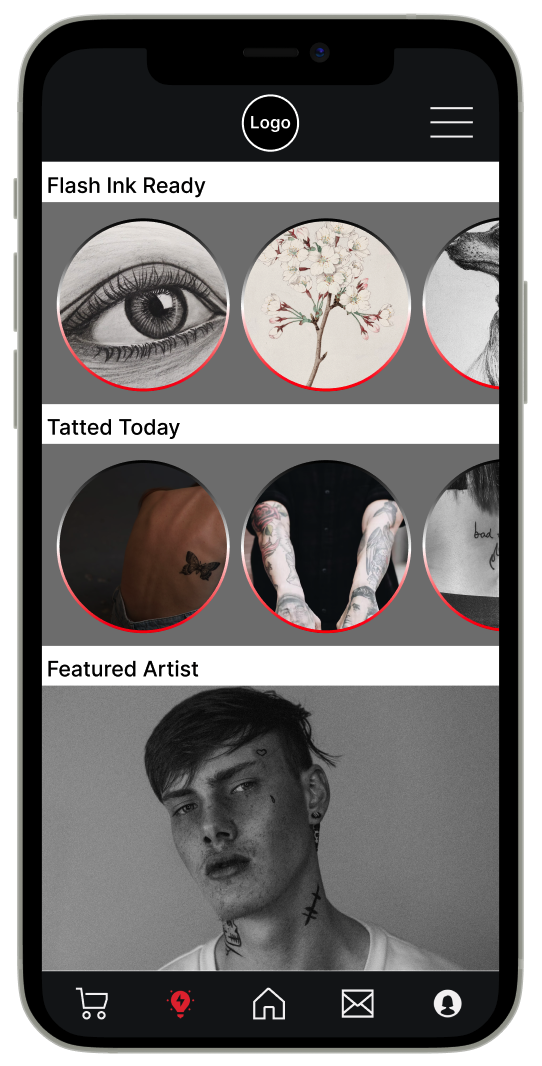
The mission for this product is to create an app for tattoo artists so the artists needed to be placed front and center. The new tab provides a space for discovery and inspiration for users who are browsing and not necessarily searching for ink.
It provides a space for artists to post flash services, or their finished work of the day, or to be given a profile boost through the featured artist section.
